
Four ways your cart and checkout could work
Each one is a working sample: start at the cart, go through Information, Shipping and Payment, and try the coupon, the second-copy offer and the shipping choices. Nothing is charged and nothing is saved.
- Your real contentLogo, product photos, review numbers and customer quotes are yours.
- Today's real pricesShipping options and arrival dates came from the store's own rate engine.
- Order always in viewItems, coupon, upsell, totals and arrival date never leave the screen.
- Phone, tablet, desktopAll four reflow. Shrink the window or open them on your phone.
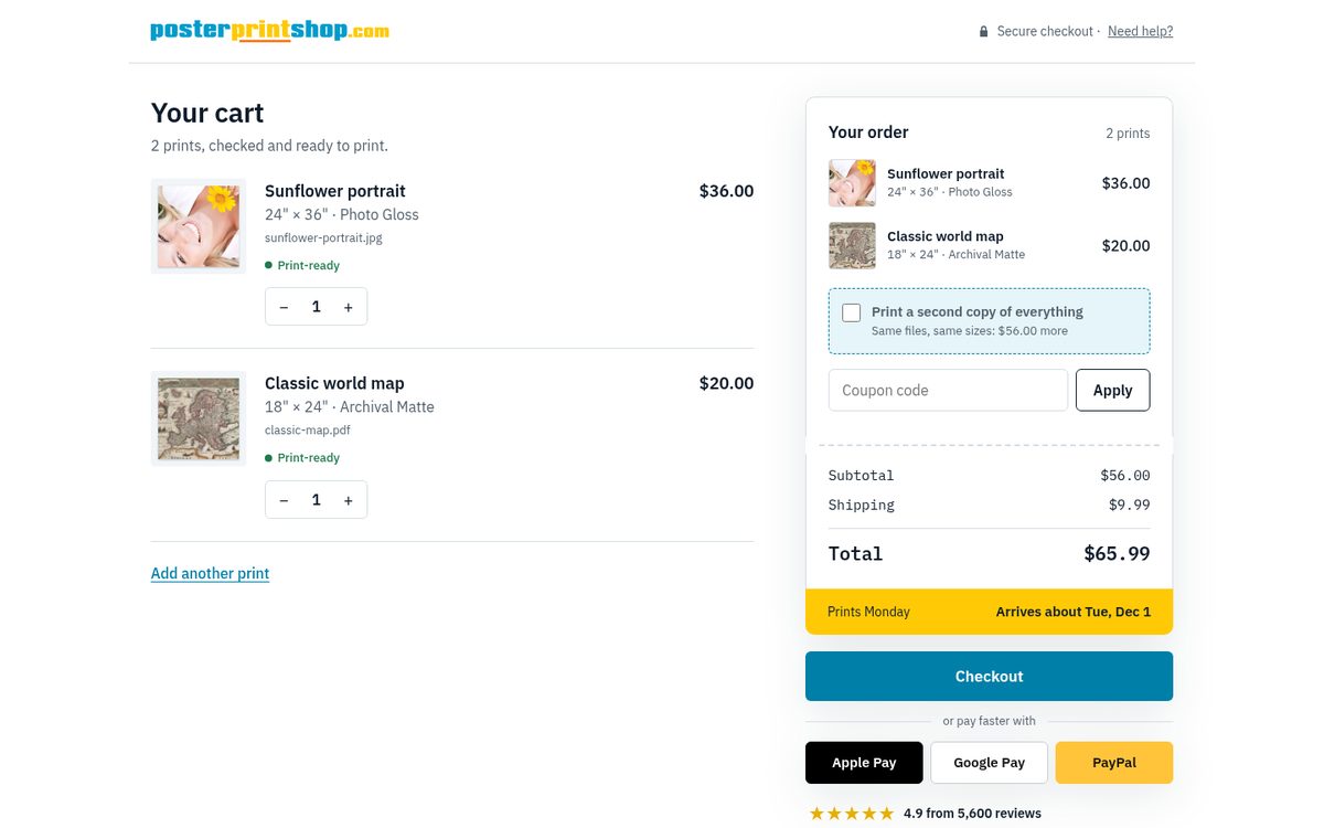
1. Job ticket Open it
The order is drawn as a print-shop work ticket, with the arrival date printed on its stub. The three steps sit on one page and fold up as you finish them.
- Steps
- One page, each step folds into a one-line summary with Edit
- Feels
- Precise, technical, like a real print order
- Best at
- Never losing your place; quick edits
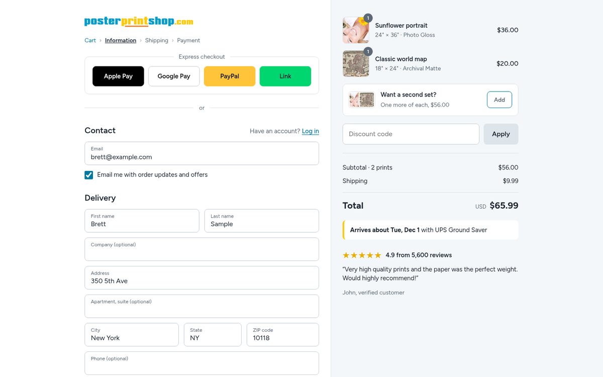
2. Storefront classic Open it
The layout shoppers already know from the best Shopify stores: breadcrumb, express checkout up top, one step per page, summary in a quiet side panel.
- Steps
- Separate pages with Cart › Information › Shipping › Payment
- Feels
- Familiar and trustworthy
- Best at
- Zero learning curve; safest for conversions
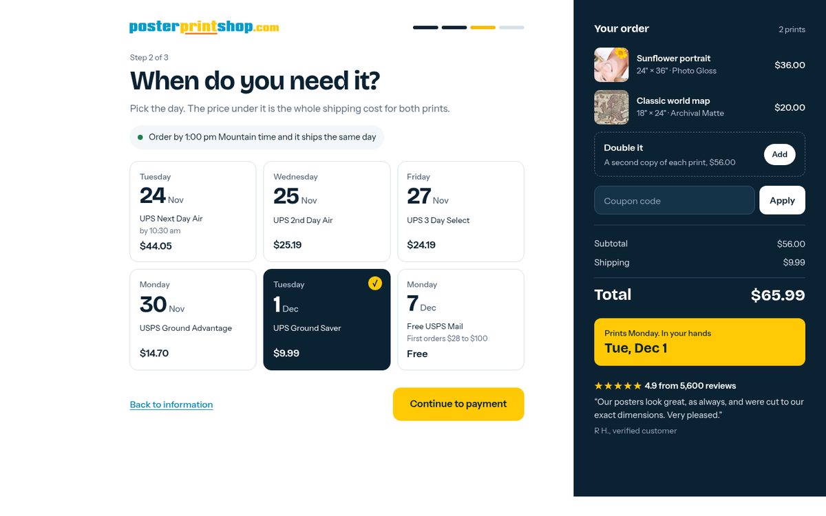
3. Arrival first Open it
Built around the question your customers actually have: when will it get here? Shipping is chosen by the day it arrives, and the promise stays on a yellow card in a dark order panel.
- Steps
- Separate pages, each asks one plain question
- Feels
- Bold and confident
- Best at
- Selling faster shipping; deadline orders
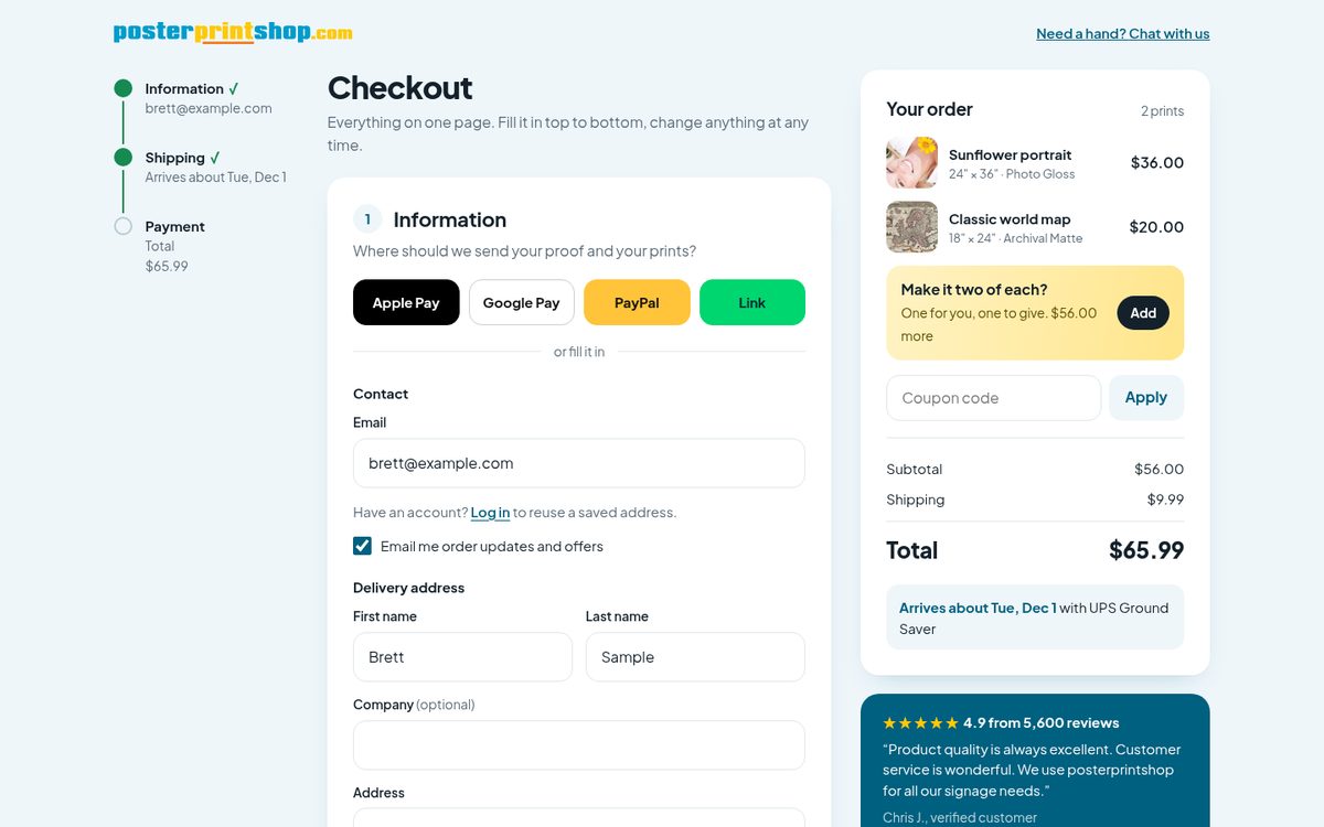
4. One calm page Open it
Everything open on a single page, in soft cards, with a progress rail on the left that fills in as you type. On a phone, the total and the Pay button stay pinned to the bottom.
- Steps
- One page, all three sections visible at once
- Feels
- Friendly and light
- Best at
- Speed on phones; fewest taps
Ideas borrowed, and from where
- Express buttons before the form, and a summary that stays put: standard in every top Shopify checkout in your screenshot.
- Reviews and guarantees shown before the card fields, not after: the trust pattern Shopify highlights.
- Exactly one upsell, placed before payment: the second-copy offer.
- Review box of what you already entered, with Change links: Shopify's own multi-page flow (proposals 2 and 3).
- The ticket, the date tiles and the progress rail are new for Poster Print Shop.
What is a stand-in
- The Apple Pay, Google Pay, PayPal and Link buttons are labelled placeholders. On the real checkout Stripe and PayPal draw their own.
- The card fields stand in for Stripe's payment box, which will take on the chosen proposal's colors.
- The second-copy offer shows full price. Any discount on it is your call.
- WELCOME10 is a sample coupon, 10% off.
- Log in opens a sample password field. Accounts are on the before-launch list.